Challenge
Since its 2009 U.S. launch, McCafé struggled to match its international success, facing intense competition from chains like Starbucks. The coffee category had become increasingly competitive, with consumers expecting café-quality beverages and a more elevated experience. To gain ground as a serious coffee destination, McDonald's needed to elevate its brand experience and quality while maintaining its core value and convenience.
Solution
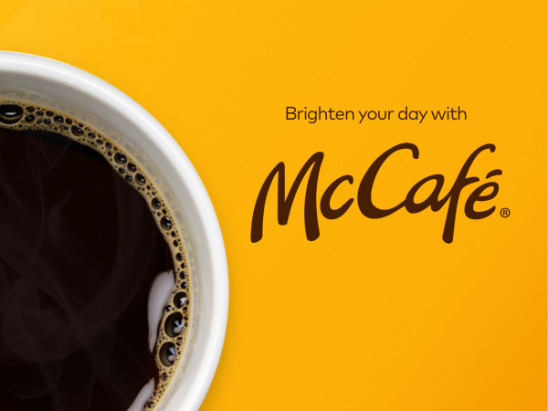
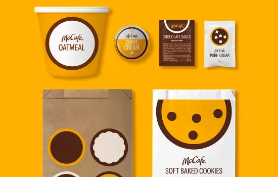
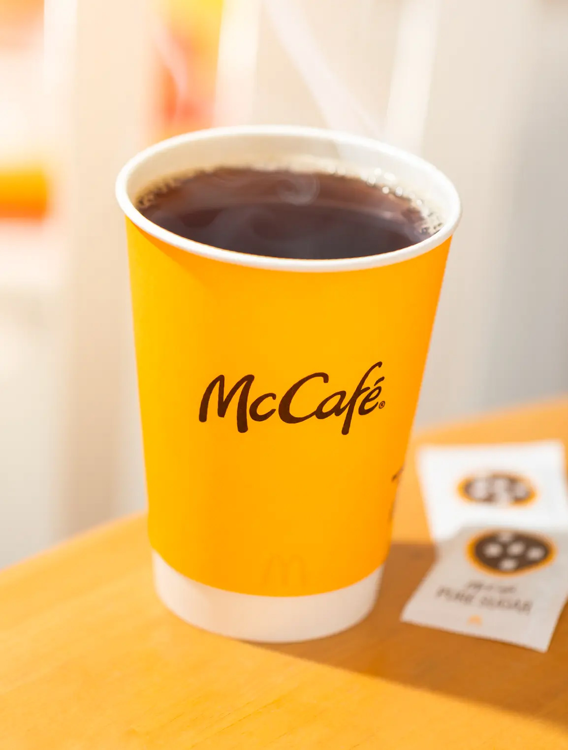
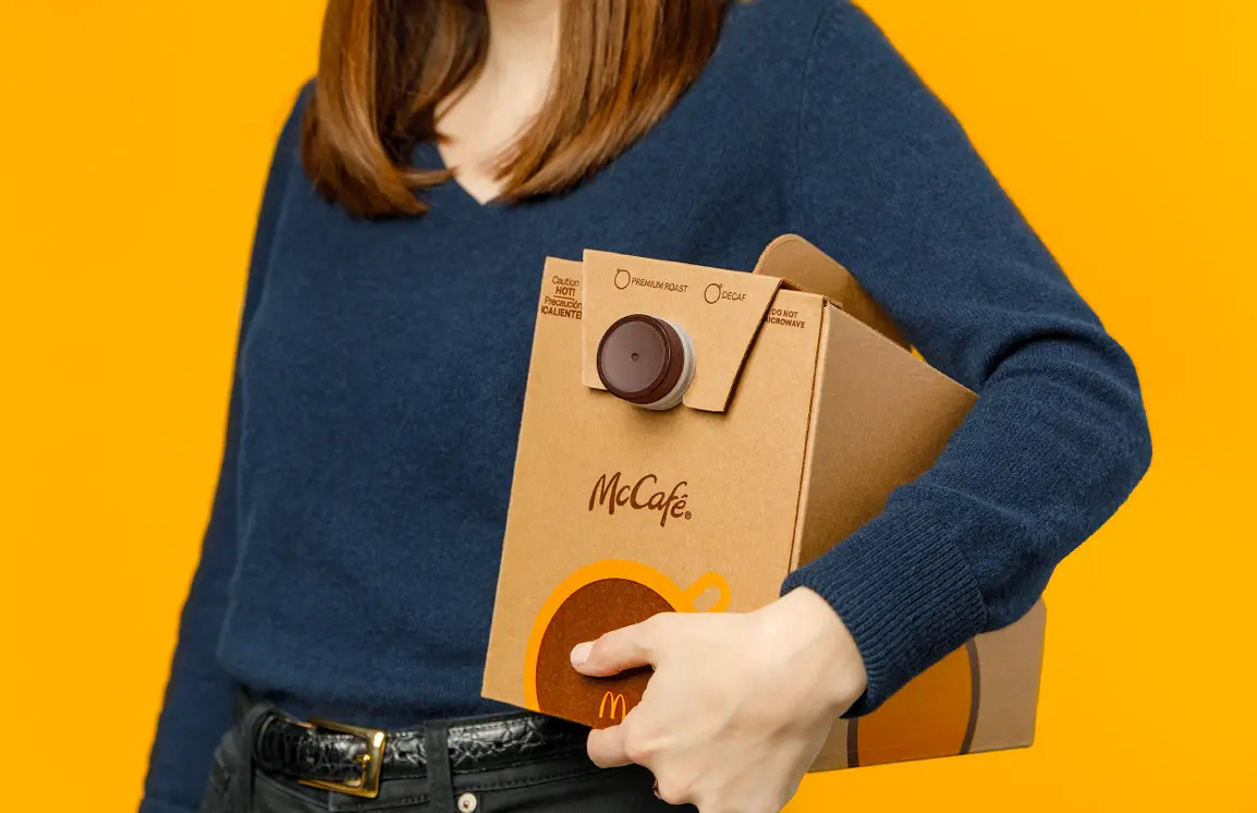
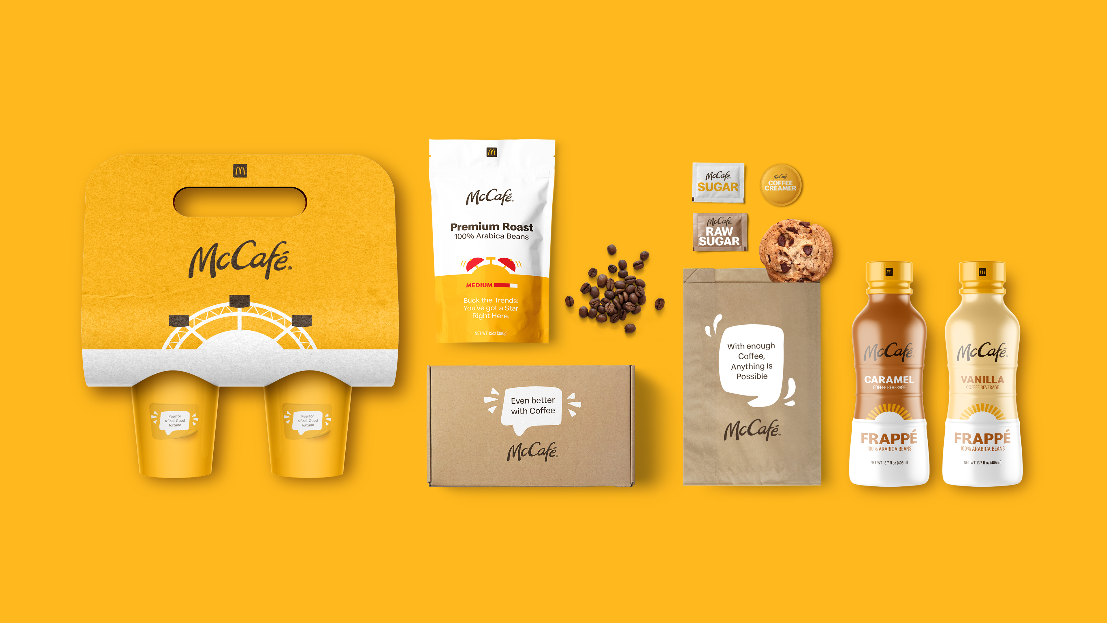
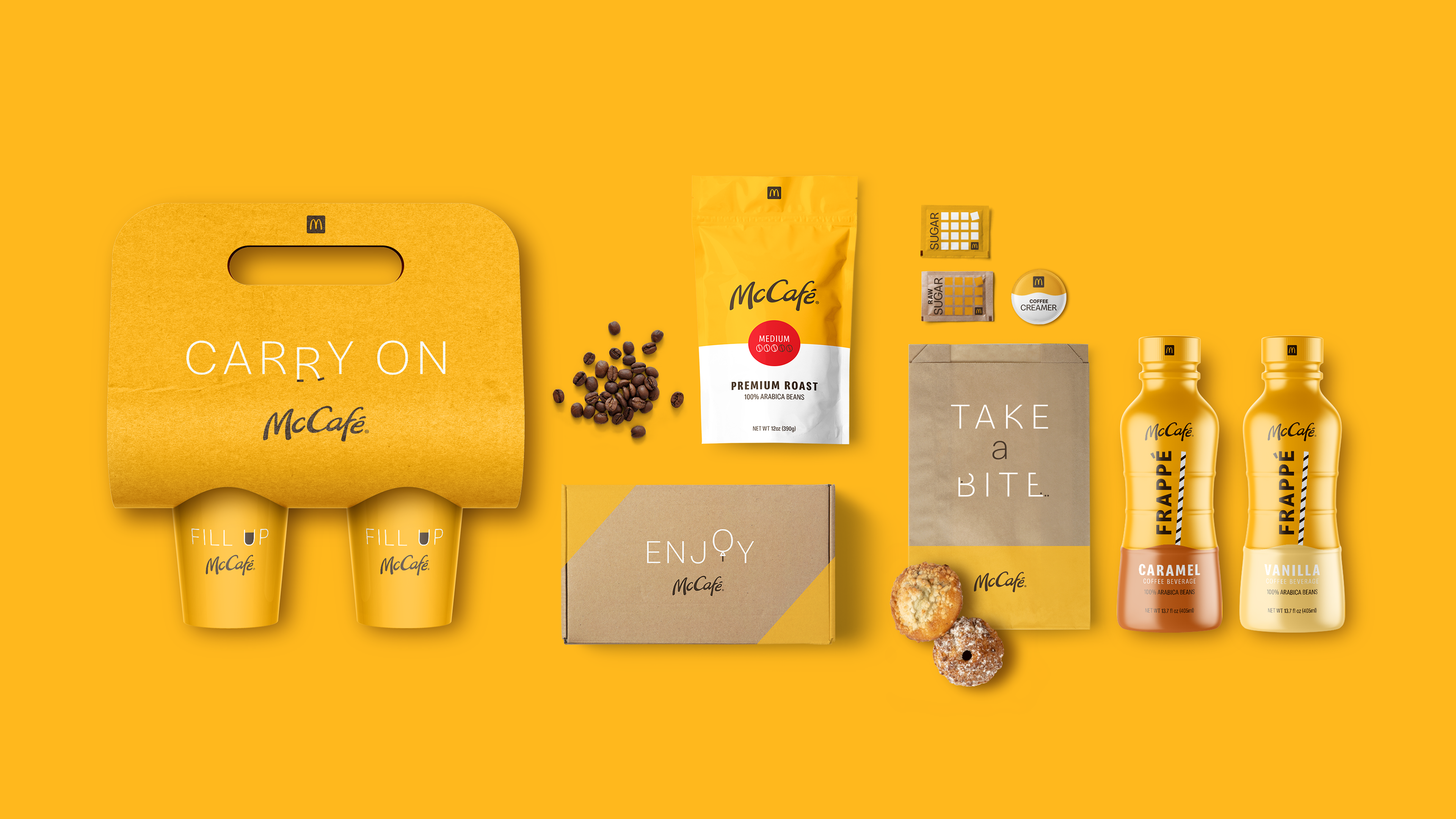
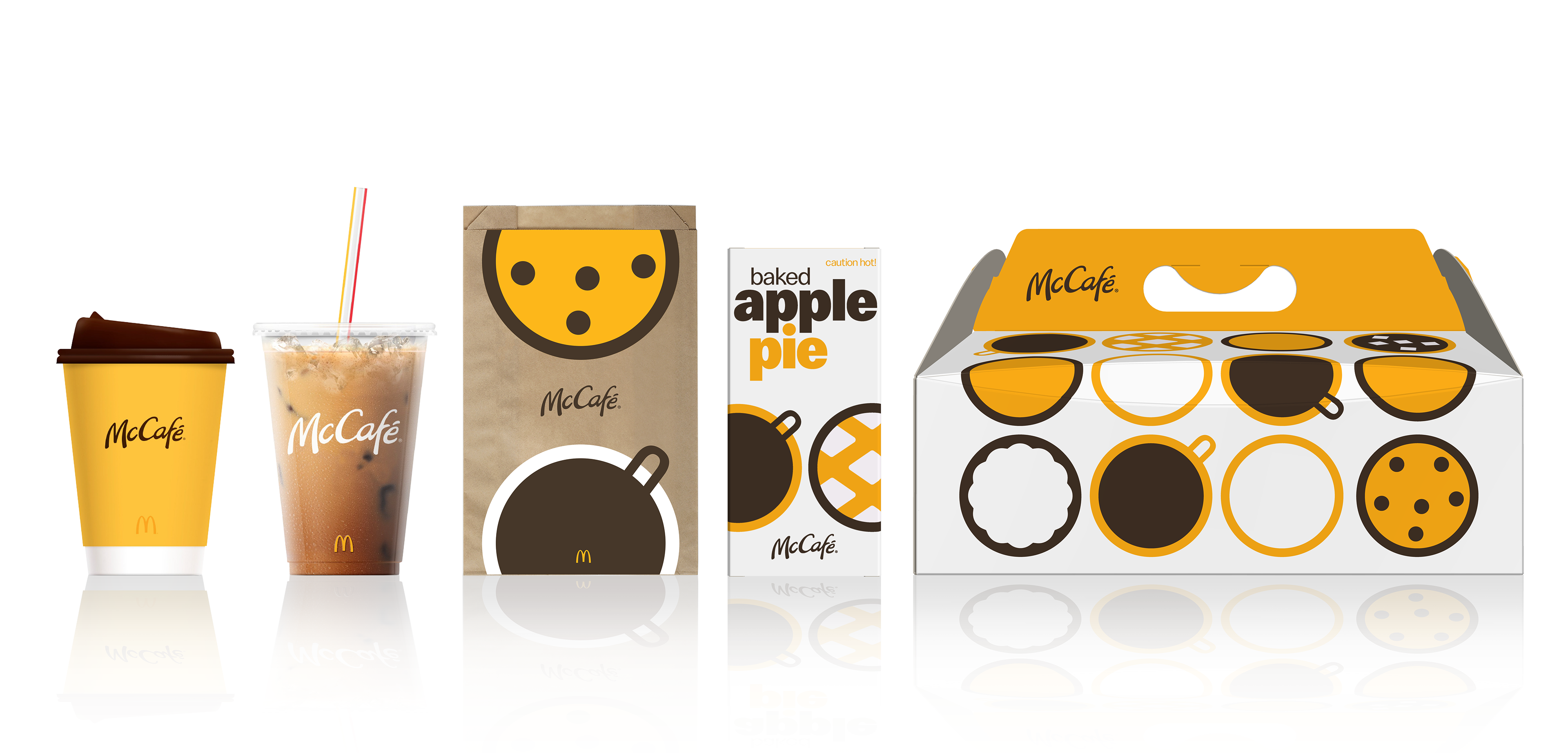
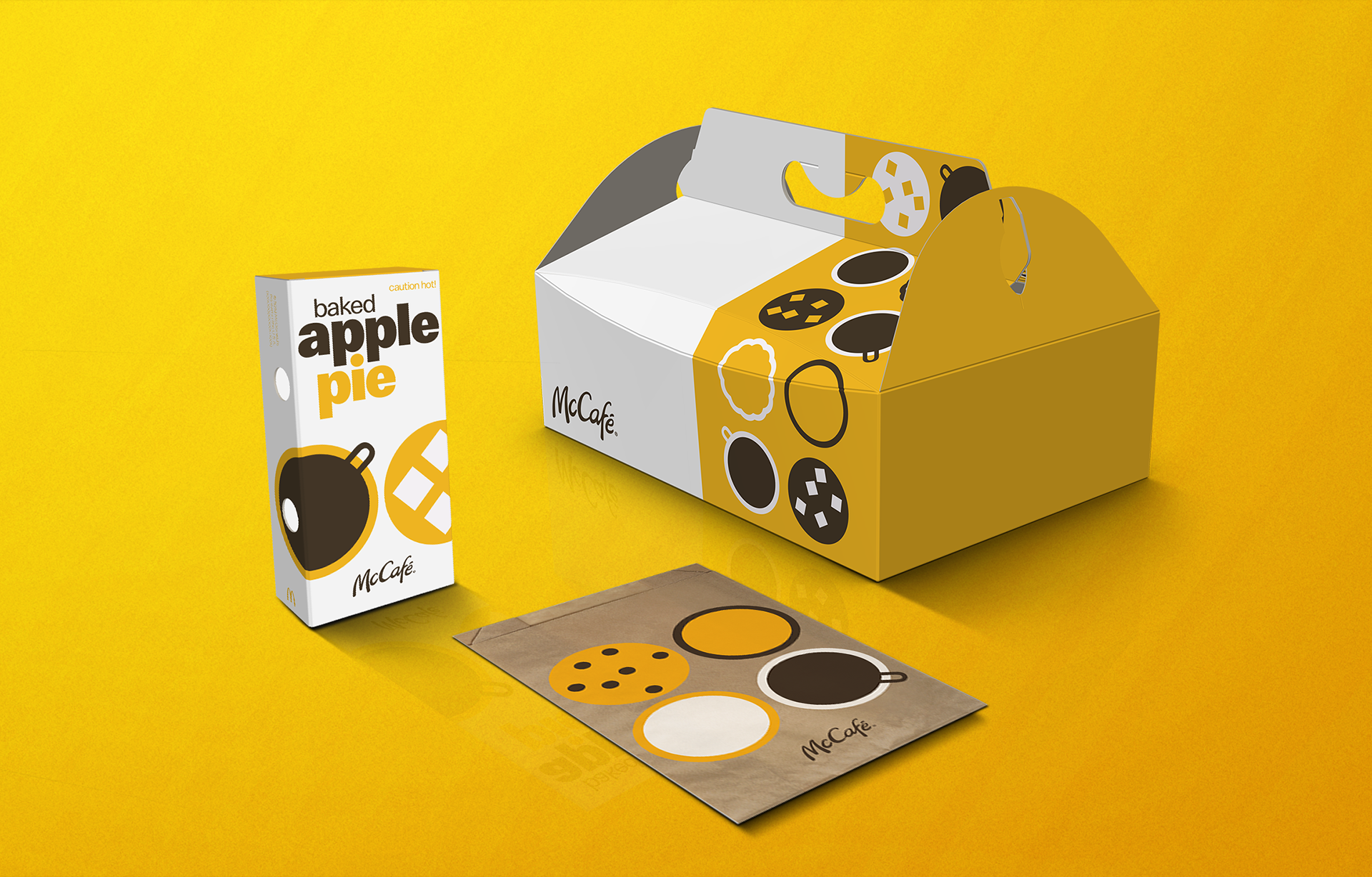
I supported the creative strategy for a comprehensive brand restage that transformed McCafé through product innovation and a modernized identity. The design refresh was built around a philosophy of simplicity, reduction, and iconography. The new visual language was intentionally understated to stand out by not trying too hard, in a market full of overcomplicated coffee branding. The wordmark's was simplified creating a bolder, more minimalist brand identity that aligned with McDonald's broader modernized product. McCafé introduced new golden cups as the centerpiece of the packaging refresh, designed to match the company's "gold standard for quality coffee". The new sunny color signaled optimism and the feel-good moment of that first sip. The look was extended across pastry bags and other packaging. The new look was accompanied by a new brand tagline "Good is Brewing" inspired by the concept that "good is always brewing with McCafé because good people deserve good coffee".
Since its 2009 U.S. launch, McCafé struggled to match its international success, facing intense competition from chains like Starbucks. The coffee category had become increasingly competitive, with consumers expecting café-quality beverages and a more elevated experience. To gain ground as a serious coffee destination, McDonald's needed to elevate its brand experience and quality while maintaining its core value and convenience.
Solution
I supported the creative strategy for a comprehensive brand restage that transformed McCafé through product innovation and a modernized identity. The design refresh was built around a philosophy of simplicity, reduction, and iconography. The new visual language was intentionally understated to stand out by not trying too hard, in a market full of overcomplicated coffee branding. The wordmark's was simplified creating a bolder, more minimalist brand identity that aligned with McDonald's broader modernized product. McCafé introduced new golden cups as the centerpiece of the packaging refresh, designed to match the company's "gold standard for quality coffee". The new sunny color signaled optimism and the feel-good moment of that first sip. The look was extended across pastry bags and other packaging. The new look was accompanied by a new brand tagline "Good is Brewing" inspired by the concept that "good is always brewing with McCafé because good people deserve good coffee".
Results
The refresh successfully modernized McCafé's brand presence and reinforced its position within McDonald's growth strategy. The brand remained a priority for McDonald's, with leadership emphasizing their continued commitment to making McCafé "a go-to coffee destination for customers".
Initial concept ideation
Concept Refinements
Final Design